Duke Farms
Digital Guide App
Designing a mobile guide for 240,000 annual visitors
Role
Lead UX Designer
Timeline
8 months (2018-2019)
Team
3 people
Outcome
14,000+ users → evolved into Bloomberg Connects platform
SITUATION
Duke Farms is a 1,000+ acre nature preserve and research institution in New Jersey serving 240,000 annual visitors.
The property had no coherent wayfinding system, just fragmented touchpoints that failed visitors at critical moments.
Before jumping to solution ideation, I needed to understand why existing wayfinding was failing. Through site observation and stakeholder interviews, I mapped the current state:
Touchpoints
Failure Mode
Laminated map in Orientation Center
Static, not portable--visitors couldn't take it with them
Paper handout maps
Got lost/damaged; environmental waste; no real-time info
Wayfinding signage
Faded, inconsistent placement, hard to see in wooded areas
Staff directions
Pulled staff from primary duties; inconsistent information
Website
Outdated, difficult to navigate--couldn't plan visits effectively
TASK
Lead research and design of a mobile app that empowers visitors to self-navigate the property and engage with educational content.
My Responsibilities
Observational research, problem definition and opportunity framing, user research, information architecture and nav strategy, wireframing and prototyping, visual design system, usability testing and iteration, app store assets and launch support.
Constraints
Delivered on iOS and Android within 8 months, built on existing infrastructure (The Highline) to control costs.
ACTION 1
Discovery & Problem Definition
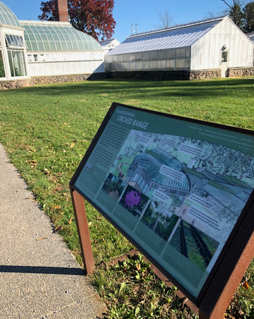
Site visit: I explored the property as a first-time visitor and experienced the failure modes firsthand. I even got lost.
Key observation: Even with a bike, I couldn't reference the map while riding and faded signage was invisible in wooded areas.
Empathy mapping: Synthesized observations + staff's years of visitor feedback into a map of what visitors say, think, do, and feel at key moments.
Competitive Analysis: Evaluated comparable park/preserve apps to identify patterns and gaps.
Website Evaluation: Evaluated the Duke Farms website and found it difficult to navigate. It was hard to plan a visit. The visual design was also poor quality, so I would need to develop a better interpretation of the brand for the app's UI.
The problem: Visitors couldn't maintain orientation while exploring, and the property had no scalable way to deliver contextual information at the moment of need.
ACTION 2
Defined Jobs-to-be-Done
High-level functional / emotional goals:
Primary JTBD
"When I'm exploring an unfamiliar 1,000-acre property, I want to know exactly where I am and how to get back, so I can explore confidently without anxiety about getting lost."
Secondary JTBDs by User Segment
-
First-time Visitors: "Help me see highlights efficiently so I make the most of my visit."
-
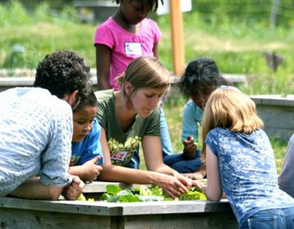
Educational Group Leaders: "Help me navigate with a group of kids so I can focus on teaching, not logistics."
-
Visitors with Disabilities: "Help me identify accessible routes so I can explore independently."
-
Repeat Visitors: "Help me find what's new or seasonal so each visit feels fresh."
Situational Jobs
-
On a bike, hands occupied: "Let me confirm I'm on the right path or understand the context of where I am without needing to pull out my phone."
-
At a site, curious:"Tell me why this place matters without making me read a plaque."
-
Ready to leave, tired: "Show me the fastest route back to where I started."


ACTION 3
Information Architecture
& Navigation
The core challenge: How do you organize content for users with fundamentally different goals?
A first-time visitor wants highlights. An educator wants program schedules. A visitor with disabilities wants accessibility info. The same content, different entry points.
Strategic decision: Multi-modal navigation.
-
Primary action: Map (always accessible)
-
Secondary: Content by goal (explore / plan / learn)
7 rounds of application mapping to align team on scope and resolve conflicts.
ACTION 4
User Flows & Wireframes
105 wireframes across 2 rounds, progressing from low fidelity to high fidelity.
Key user flow: "Get back to Orientation Center"
This was the highest-anxiety moment for visitors and the task with the highest error rate in usability testing. So, I designed a solution that required zero navigation.


ACTION 5
Design System & Visual Language
Created visual assets that extended Duke Farms' brand identity while solving functional problems:
400+ custom icons: Map markers, map UI elements, weather icons
Custom illustrations: Onboarding, empty states, Eagle Cam
Extended color system: Accessibility contrast + brand cohesion
Simplified logo: App header, greater versatility
Design decision: Icon consistency
The property had no existing icon library. I created a unified set that could scale across the app and future touchpoints (signage, print, web).
ACTION 6
Usability Testing & Iteration
3 remote 1:1 moderated usability sessions via Skype with task-based scenarios.
Task: Find way back to Orientation Center on the map
Success Rate: 1/3
Issue: FAB purpose unclear
Task: Complete an audio tour for the Hay Barn
Success Rate: 3/3
Issue: N/A
Task: Find accessibility info
Success Rate: 2/3
Issue: Buried in menu hierarchy
Task: Add a site to favorites
Success Rate: 3/3
Issue: N/A
Critical Finding
Issue: Users didn't understand the floating action button for "return to Orientation Center."
Solution: Added a first-time tool-tip explaining the feature.


RESULTS + RELEVANCE
"It has allowed us to decrease the reliance on staff for directions [and] reduce the use of paper maps."
User Adoption: 14,000 users in 2023; 80-150 daily downloads in summer.
Engagement: 20-minute average session; 595 audio tour users.
Operational Impact: Reduced staff burden for directions; reduced paper map usage.
Longevity: 5 years in production → evolved into Bloomberg Connects platform (Nov 2024).
Delivery: On time, on budget; website redesigned to match app quality.
Metric
Result
User Adoption
14,000 users in 2023; 80-150 daily downloads in summer
Engagement
20-minute average session; 595 audio tour users
Operational Impact
Reduced staff burden for directions; reduced paper map usage
Longevity
5+ years in production; Evolved into Bloomberg Connects platform (Nov 2025)
Delivery
On time, on budget; website redesigned to match app quality
Strategic Impact
The information architecture and user flows I designed in 2019 were strong enough that when Duke Farms migrated to Bloomberg Connects (the platform used by MoMA, the Guggenheim, and 300+ cultural institutions), they retained the core UX patterns:
-
Interactive map as primary navigation
-
Self-guided audio tours
-
Accessibility as first-class feature
-
Consolidated visitor information
EVOLUTION
What I learned
-
Problem definition is the highest-leverage activity. The real problem wasn't "build an app"—it was "visitors can't maintain orientation." That framing shaped every design decision.
-
Jobs to Be Done reveals conflicting needs. First-time visitors and repeat visitors have different jobs. The IA had to serve both without fragmenting.
-
One usability fix can solve the biggest anxiety. The tooltip for "return to Orientation Center" addressed the #1 fear (getting lost) with minimal development effort.
What I'd do differently
-
Test with actual visitors on-site. Remote testing with my network missed the context of being physically lost on the property.
-
Document the design system formally. The icons and patterns I created weren't documented well enough for future maintainers.
-
Build a decision log that's accessible to the team and easy to scan. We did have a Google doc...but it got long and overwhelming or anyone beyond myself. Also, linking each design choice to research evidence would have helped with stakeholder alignment and future iteration.
What happened next
-
App received quarterly updates for 5+ years post-launch
-
QR code scanning and iPad support added based on ongoing user analysis
-
November 2025: Duke Farms launched next-generation Digital Guide powered by Bloomberg Connects
-
The new guide retains the core UX patterns I established.
The foundation I designed in 2019 scaled into an enterprise-grade solution adopted by one of the world's leading cultural technology platforms.
Tools: Sketch • InVision • Illustrator • Photoshop
Skills: Problem Definition • Jobs to Be Done • Information Architecture • User Flows • Site Mapping • Wireframing • Usability Testing • Icon Design • Design Systems


